![]() Jun 10
Jun 10

Price Elasticity

Concept
The concept of price elasticity is pretty easy to grasp.
In economics, it is a measure of how sensitive demand or supply is to price.
In marketing, it is how sensitive consumers are to a change in price of a product.
There are many determinant of elasticity that are both supply-side and demand-side. Nevertheless we can distinguish two types of price elasticity:
Own price elasticity: changes in demand of a single product due to its price
Cross price elasticity: with changes in demand of one product due to changes in price of another.
Understanding elasticity allows us to identify the optimal point for revenue – since we have reducing marginal returns on price increments. Graphically the optimal point lies at the frontier of the Price vs. Quantity graph depicted below:

Own Price Elasticity

Imagine you were going to buy an apple from the local market where there are only 100 apples and 100 customers including yourself. The price of apples on the day is $2 and every person can only buy 1 apple.
At a price of $2 perhaps 80 people would be willing and able to buy an apple at the $2. If the price of an apple suddenly became $100 per apple, chances are no one would be willing and/or able to buy an apple. At a price lower than $2 we might see a few more people buying apples, or none at all.
The same dynamic applies to quantities where a drop or rise in the availability of apples would impact how much people are able and willing to pay for a product.
We therefore arrive at the formula for price elasticity of demand is given by either of the following:
- PE = (ΔQ/Q) / (ΔP/P)
- PE = (ΔQ/ΔP) * (P/Q)
- P is price
- Q is quantity
- ΔQ is the change in quantity
- ΔP is the change in price
Let us look at an example.
Imagine you are a sales person in the market and you sell apples .. green shiny ones that makes people’s mouths water with delight. You currently sell like everyone else in the market an apple for $2 and sell 100 apples each day.
You want to sell more and therefore you decide to play the price game (…bad idea, but that’s for another post…) and cut the price to $1.99 (…nice move, sales person, nice move…). The next day rolls over and you end up selling 110 apples.
How elastic is demand?
It’s 20 … but what does that mean?
It means for every percentage drop in price, you get 20 percent increase in quantity.
Elasticity Interpretation
Generally, we can interpret price elasticity values with the following ranges:
- PE equal to 0: Perfectly inelastic demand – meaning that price has no impact on quantity.
- PE between -1 and 1: Relatively inelastic demand
- PE larger than 1: Changes in price impact demand in opposite direction.
- PE less than -1: Changes in price impact demand in the same direction.
Cross Price Elasticity

Imagine you grew your business and now own an entire supermarket.
You now sell apples, juice, eggs, flour, cookies and all sorts of great products!
You start thinking about the pricing strategy of your products and you set prices for each product. You notice that changing the price of eggs impacts sales (as it should do!). You start to do the elasticity calculations and you realize that increasing the price of flour reduces sales not only in flour, but also in eggs. Another oddity is that eggs sales pick up slightly when you increase the price of cookies.
Soon you realise that the changes you make in the price of flour impact that changes in quantities sold of eggs. Likewise, the increase in price of cookies impacts the sales of eggs. People start making their own cookies rather than buying them ready made if they are too expensive!
This is called cross price elasticity and is calculated as follows:
- CPEeggs,cookies = (%ΔQeggs / %ΔPcookies)
We calculate %ΔQ and %ΔP as follows:
- %ΔQ = Qstart – Qend / (Qstart + Qend) ÷ 2
- %ΔP = Pstart – Pend / (Pstart + Pend) ÷ 2
Lets take a look at an example. Suppose that you had cookies priced at $5 and eggs at $2 selling 100 units and 50 units respectively. You decided to increase the price of cookies because they are awesome and stuff to $8! Your customers are angry cookie monsters and you only manage to sell 10 cookies after the price hike. On the other hand, your egg sales fly through the roof at 100 units. It seems like many cookie monsters decided to bake at home.
We would then get CPEeggs,cookies = %ΔQeggs / %ΔPcookies = (~33%) / (~23%)
This gives a CPE of 1.44 … but what does this mean?
The positive relationship between eggs and cookies indicate that they are good substitutes for one another. That a change in price of eggs by one percent increases the sales of cookies by 1.44. If the relationship was negative, they would be complements to one another.
Next Steps
We now know that elasticity tells us about how sensitive our customers are to the price of one product or the relative price of another. We can use this information provided historical data, but as the adage goes: hindsight is 20-20.
The next step would be to be able to predict or model the relationship between quantity and price and determine elasticity. This should start to sound familiar if you have had any experience with regression modelling. A regression model would take the form of:
- Quantityeggs = A x Priceeggs + B x Pricecookies + e
Where A and B are some coefficient and e is a constant.
We would then have the predicted relationship between quantity and the price of each product in our supermarket. Calculating price elasticity and cross price elasticity then becomes relatively easy.
This is precisely what we will do with R in the next post on Price Elasticity with R!
![]() Posted by Salem
Posted by Salem
![]() May 31
May 31

Overweight in Kuwait – Food Supply with R

Disclaimer
I cannot say this enough … I have no idea about nutrition. In fact, if one were to ask me for a dietary plan it would consist of 4 portions of cookies and 20 portions of coffee. The reason I am doing this is to practice and demonstrate how to do some analysis with R on interesting issues.
The Problem: Food! (…delicious)
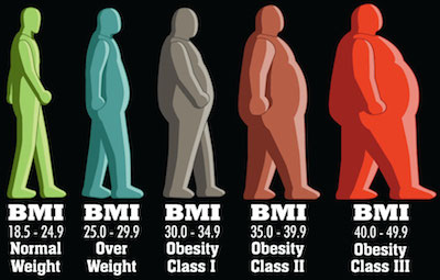
We already looked at the obesity in Kuwait using BMI data. What we found was that indeed, irrespective of gender, Kuwait ranks as one of the top countries with a high proportion of the population deemed obese (BMI >= 30).
The question we did not address is what might be the cause of this obesity. Following in the paths of the WHO’s report on “Diet, food supply, and obesity in the Pacific” (download here) we hope to emulate a very small subset of correlations between the dietary patterns and the prevalence of obesity in Kuwait.
Since this is only a blog post, we will only focus on the macro-nutrient level. Nevertheless, after completing this level we will be well equipped to dive into details with R (feel free to contact me if you want to do this!)
Conclusions First! … Plotting and Stuff
Lets start by plotting a graph to see if we notice any patterns (click it for a much larger image).

What does this graph tell us?
- The black line represents Kuwait figures.
- The red dots represent the average around the world
- The blue bars are top 80% to lower 20% of the observations with the medians marked by a blue diamond.
Lets make some observations about the plot. For brevity we will only highlight things relevant to obesity being mindful of:
- the fact that I know nothing about nutrition
- that there are other interesting things going on in the plot.

Cereals have been increasing since 1993. This means that the average Kuwaiti consumes more cereals every day than 80% of the persons around the world. The implication is, as explained in Cordain, 1999 that people who consume high amounts of cereals are “affected by disease and dysfunction directly attributable to the consumption of these foods”.

Fruits & Starchy Roots both show trends that are below average. Both are important sources of fiber. Fibers help slim you down, but are also important for the prevention of other types of diseases; such as a prevalent one in Kuwaiti males: Colorectal cancer.
The consumption of vegetables perhaps serves as a balancing factor for this dietary nutrient of which the average Kuwaiti consumes more of compared to 80% of the people around the world.

Vegetable Oils is my favourite … the only thing that stopped the rise of vegetable oil supply in Kuwait was the tragic war of 1990. In 2009 the food supply per capita in Kuwait was well over the 80th percentile in the rest of the world. Vegetable oils not only cause but rather promote obesity. We don’t love Mazola so much anymore now do we?

Sugars & Sweetners have already made an appearance in another post and here we have more data. The findings are similar, the average Kuwaiti consumes much more sugar than the average person around the world. This not only contributes to obesity but also other diseases such as diabetes.
Data Gathering
So lets get going … where’s the data at?!
The Food and Agriculture Organization of the United Nations have a pretty awesome web portal that contains a lot of rich data. We are interested in data sets concerned with “Food Supply”. Particularly we want to look at:
… because there are only two types of food in the world: Vegetable and Not Vegetable … (cookies are vegetables)
So lets go ahead and download data sets that we want. You will find the selection for Food Supply of Crops. You will want to make sure all fields match:
- Select all countries.
- Use aggregated items
- Leave out grand totals from the aggregated items
- Choose the years you are interested in; I chose 1980 to 2009.
- All checkboxes checked
- Drop-down: output table, no thousands separator, no separator and 2 places for decimals.

Click download and you’re set for Crops!
Now repeat for the Food Supply of Livestock.
Making CSV Files
Now we have 2 XLS files that we can work with. The irony is that these are not excel files at all … they are HTML files
So the first thing we need to do is rename the 2 downloaded folders to “first.html” and “second.html” – it does not matter which one is first or second.
You will notice that the files are huge. So expect the next step to take time.
We will be using the XML library to read the files: first.html and second.html
We know that the files do not contain any headers and we do not want any white spaces.
We will make sure that the data is read into a data frame so we can work with data frame functions.
# Load libraries library(XML) # Read HTML Tables first<-readHTMLTable('first.html',header=F,trim=T,as.data.frame=T) second<-readHTMLTable('second.html',header=F,trim=T,as.data.frame=T) # Make sure that the data is of class data.frame first<-as.data.frame(first) second<-as.data.frame(second) |
We now have our data frames and if we look into the data we can figure out what our headers should be.
So lets rename the headers now:
# Make header names headers<-c("Domain","Country","CountryCode","Item","ItemCode","Element","ElementCode","Year","Unit","Value","Flag","FlagDescription") names(first)<-headers names(second)<-headers |
Great! Now we can finish up by writing CSV files that are smaller in size and faster to read the next time we want to run the analysis:
# Write the CSV file for future use write.csv(first,'first.csv') write.csv(second,'second.csv') |
Data Munging
We are now ready to play with the data. We will be using 2 libraries: dplyr to manage the data and ggplot2 for plotting. Load them up:
# Load libraries library(dplyr) library(ggplot2) |
Lets pretend we are starting from scratch and want to read in the data from the CSV files we created.
You will notice read.csv adds a column so we will also need to rename our headers.
# Read files first<-read.csv('first.csv') second<-read.csv('second.csv') # Set header names headers<-c("ID","Domain","Country","CountryCode","Item","ItemCode","Element","ElementCode","Year","Unit","Value","Flag","FlagDescription") names(first)<-headers names(second)<-headers |
We now want to combine the Livestock and Crops data in the two files. This can be easily done with the rbind() function:
data<-rbind(first,second) |
Great now we need to stop and think about what we want to do with this data.
We want to compare Kuwait’s nutritional information with some sort of summary data about the rest of the world. We can therefore break this up into 2 parts: Kuwait and Other.
Let us deal with Kuwait first and extract the calculated data for grams consumed per capita per day. If you look into the dataset you will know which filters to apply. We will apply those filters using the subset function:
# Extract Kuwait Data data.kuwait<-subset(data,data$Country %in% "Kuwait" & data$"FlagDescription" %in% "Calculated data" & data$"ElementCode" %in% "646") |
Now we want to extract the same information for every other country except Kuwait. That is easy enough, just copy and paste the function from above and :
# Extract Other Countries data data.other<-subset(data,!(data$Country %in% "Kuwait") & data$"FlagDescription" %in% "Calculated data" & data$"ElementCode" %in% "646") |
We need to do a bit more work with the other countries’ data. We said we want summary information and right now we only have raw data for each country. We will use the chaining mechanism in ‘dplyr’ to create summary data such as the mean, median, and upper/lower quantiles. We will group the data by Year and we will then group it by Item (Nutrient).
# Create summary data data.other.summary<- data.other %.% group_by(Year) %.% group_by(Item) %.% summarise(mean=mean(Value), median=median(Value), lowerbound=quantile(Value, probs=.20), upperbound=quantile(Value, probs=.80)) |
This is the same method we used earlier when looking at Sugar grams consumed per capita per day in an earlier post.
Great, our data is ready for some exploration.
GG Plotting and Stuff!
The ggplot code looks like a big ugly hairball … but I will explain it line by line.
# Plot ggplot(data = data.other.summary, aes(x = Year, y=median))+ geom_errorbar(aes(ymin = lowerbound, ymax = upperbound),colour = 'blue', width = 0.4) + stat_summary(fun.y=median, geom='point', shape=5, size=3, color='blue')+ geom_line(data=data.kuwait, aes(Year, Value))+ geom_point(data=data.other.summary, aes(Year, mean),color=I("red"))+ ggtitle('Supply (g/capita/day) - Kuwait vs. World')+ xlab('Year') + ylab('g/capita/day')+ facet_wrap(~Item,scales = "free")+ theme(axis.text.x = element_text(angle = 90, hjust = 1)) |
- Line 1: We start by creating a plot using the data set for the rest of the world and plot median values by year.
- Line 2: We then overlay the blue bars by passing in our summary stats lowerbound and upperbound calculated in the previous step.
- Line 3: We then pass the median values and set the shape to 5 – diamond.
- Line 4: We plot the black line using the Kuwait data set’s values by year.
- Line 5: We plot the averages in red from the rest of the world data set.
- Line 6: We set the title of the graph
- Line 7: We set the labels of the axes
- Line 8: We use the face_wrap() function to tell GG Plot that we want one graph per Item in our data set. We set the scales to “free” so that we get visible graphs (Eggs weigh less than Chicken!)
- Line 9: We set our theme elements – I just changed the angle of the X axis items
Entire Code
# Load libraries library(XML) # Read HTML Tables first<-readHTMLTable('first.html',header=F,trim=T,as.data.frame=T) second<-readHTMLTable('second.html',header=F,trim=T,as.data.frame=T) # Make sure that the data is of class data.frame first<-as.data.frame(first) second<-as.data.frame(second) # Make header names headers<-c("Domain","Country","CountryCode","Item","ItemCode","Element","ElementCode","Year","Unit","Value","Flag","FlagDescription") names(first)<-headers names(second)<-headers # Write the CSV file for future use write.csv(first,'first.csv') write.csv(second,'second.csv') # Load libraries library(dplyr) library(ggplot2) # Read files first<-read.csv('first.csv') second<-read.csv('second.csv') # Set headers for each data frame headers<-c("ID","Domain","Country","CountryCode","Item","ItemCode","Element","ElementCode","Year","Unit","Value","Flag","FlagDescription") names(first)<-headers names(second)<-headers # Combine data frames data<-rbind(first,second) # Check the Element Codes print(unique(data[,c("Element","ElementCode")])) # Extract Kuwait Data data.kuwait<-subset(data,data$Country %in% "Kuwait" & data$"FlagDescription" %in% "Calculated data" & data$"ElementCode" %in% "646") # Extract Other Countries Data data.other<-subset(data,!(data$Country %in% "Kuwait") & data$"FlagDescription" %in% "Calculated data" & data$"ElementCode" %in% "646") # Create summary data data.other.summary<- data.other %.% group_by(Year) %.% group_by(Item) %.% summarise(mean=mean(Value), median=median(Value), lowerbound=quantile(Value, probs=.20), upperbound=quantile(Value, probs=.80)) # Plotting ggplot(data = data.other.summary, aes(x = Year, y=median))+ geom_errorbar(aes(ymin = lowerbound, ymax = upperbound),colour = 'blue', width = 0.4) + stat_summary(fun.y=median, geom='point', shape=5, size=3, color='blue')+ geom_line(data=data.kuwait, aes(Year, Value))+ geom_point(data=data.other.summary, aes(Year, mean),color=I("red"))+ ggtitle(paste(' Supply (g/capita/day) - Kuwait vs. World'))+ xlab('Year') + ylab('g/capita/day')+facet_wrap(~Item,scales = "free")+ theme(axis.text.x = element_text(angle = 90, hjust = 1)) |
![]() Posted by Salem
Posted by Salem
![]() May 29
May 29

Overweight in Kuwait – BMI with R
Inspiration
Let me open with this: Faisal Al-Basri brings a lot of laughter into my life. It’s nothing short of a pleasure watching the political, social, and general satire on his instagram account. One particular post recently caught my attention – entitled: “Kuwaiti Women 2nd most obese world wide”.
In his own words:
(Rough) translation: “You have embarrassed us in front of the world. They came to take a survey, *gasp* suck your bellies in! Baby showers, weddings, graduations, divorces … guests compete on who can make yummier cakes … and in the end it’s just biscuits with double cream on top! …”
Sarcasm aside, he does a much better report than some of the newspapers in Kuwait seem to – here’s all the Arab Times had to say about this.
Well … that was insightful! For a country that is spending billions on a healthcare budget, you would think a story like this might get a little bit more love. Faisal puts some sort of analysis in place; his hypothesis is that we lead a sedentary life style with a poor diet … he’s probably right! … but we will get to that in a different study.
The Study
The study comes from a visualisation that can be found on on the DailyMail.co.uk (and conveniently pasted right here!)

There are several concerns that arise when you look at this visualisation:
The first is that the indicator of obesity is the BMIand there are several criticisms of that indicator. I know nothing about nutrition so I will stop right here and move on.
The second is that is uses the mean BMI for each country. “So what?” might the average Joe ask. Well, the problem is that the arithmetic mean is a measure of central tendency that can be misleading. If there are more people on one end of the distribution, the mean is skewed … and therefore another measure of central tendency might be better (like the median). Moreover, the mean considers population size … so a small number of outliers (whales in our case) will impact the mean in a country with a smaller population than a larger one.
Lets do the numbers
So instead of bemoaning the beautiful infographics and extensive studies … lets take a look at the figures ourselves … use R!
We can find some information about the BMI by gender in the World Health Organization’s database. The data sets used show the proportion of a population that is over a certain BMI bracket. This is great, it over comes the issues with the averages we already discussed.
Since we are dealing with obesity, we want to download the data sets labelled:
Download the files into a working directory and lets get started!
Conclusions First!
Let us take a look at the results before we get into the code. You can find all three plots that we’re going to make side by side here.
Round 1: Adult
Lets first look at the % of adults that are obese in every population. We can see comes in position 13 after the USA, UAE, Saudi Arabia, Egypt, Bahrain, and the rest.
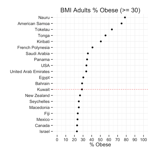
This means that, given the population of Kuwait, the ratio of obese people is less than the same ratio in 12 other countries. Is this good news? We’re still in the top 20! … but we’re not #1 (yet)
Round 2: Males
So the men had a great chuckle at these statistics I’m sure … well lets see hour our brothers at the sufra are doing. Proportionally, they are about the same as the general population: 29% … except they rank 10th now because as a ratio, our men weigh in heavier.

Round 3: Moment of truth, Ladies
Immediately we can see that the heavy set ladies in Kuwait are not #1 in the world (awww!) In fact, they are ranked in the 15th position – lower than the men and the general population. The proportion of females that are obese is only slightly higher than that of men.
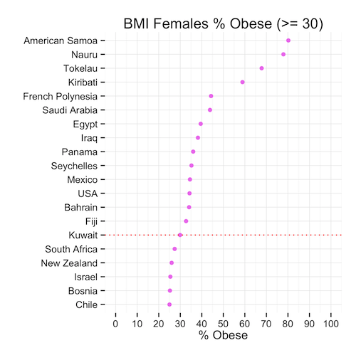
So we can conclude that, although the mean might show that Kuwait is #1 in the world, this is far from the truth when we look at the proportions that might in fact be a more representative indicator of spread and centrality of BMI.
Time for a cookie?
The Code
Lets look at how we produced the graphs. If you haven’t already, download the data sets (here or from the WHO’s website):
Now read this data intro R:
# Read Data obese.adults<-read.csv(file="BMIadults%obese(-=30.0).csv",stringsAsFactors=F) obese.male<-read.csv(file="BMImales%obese(-=30.0).csv",stringsAsFactors=F) obese.female<-read.csv(file="BMIfemales%obese(-=30.0).csv",stringsAsFactors=F) |
Great! We will need a few libraries so lets get those loaded:
# Load Libraries library(gridExtra) library(reshape) library(ggplot2) |
Now we want to play with our data before we can plot it.
We will pick the top 20 countries ordered by BMI value and create each plot accordingly.
# Select Top X Countries topx<-20 # Create Plot 1: % Adults Obese # Melt the data p1<-melt(obese.adults) # Select only the most recent data p1<-p1[p1$variable == "Most.recent",] # Sort the data p1<-p1[order(p1$value,decreasing=T),] # Remove any empty rows p1<-p1[!is.na(p1$value),] # Select Top X countries p1<-head(p1,topx) # Find Kuwait in the Top X Countries to highlight kuwait<-nrow(p1)-which(reorder(p1$"country...year",p1$value)=="Kuwait",T,T)+1 plot1<-ggplot(data=p1,aes(y=reorder(p1$"country...year",p1$value),x=p1$value))+ geom_point(color=I("black"))+ ylab("")+xlab("% Obese")+ggtitle("BMI Adults % Obese (>= 30)")+ scale_x_continuous(limits = c(0, 100), breaks = seq(0, 100, 10))+ theme_minimal()+ geom_hline(yintercept=kuwait,linetype="dotted",colour="red") |
That was the first plot, and now we repeat this 2 more times
# Create Plot 2: Females % Obese p2<-melt(obese.female) p2<-p2[p2$variable == "Most.recent",] p2<-p2[order(p2$value,decreasing=T),] p2<-p2[!is.na(p2$value),] p2<-head(p2,topx) kuwait<-nrow(p2)-which(reorder(p2$"country...year",p2$value)=="Kuwait",T,T)+1 plot2<-ggplot(data=p2,aes(y=reorder(p2$"country...year",p2$value),x=p2$value))+ geom_point(color=I("violet"))+ ylab("")+xlab("% Obese")+ggtitle("BMI Females % Obese (>= 30)")+ scale_x_continuous(limits = c(0, 100), breaks = seq(0, 100, 10))+ theme_minimal()+ geom_hline(yintercept=kuwait,linetype="dotted",colour="red") |
Finally Plot 3
# Create Plot 1: % Male Obese p3<-melt(obese.male) p3<-p3[p3$variable == "Most.recent",] p3<-p3[order(p3$value,decreasing=T),] p3<-p3[!is.na(p3$value),] p3<-head(p3,topx) kuwait<-nrow(p3)-which(reorder(p3$"country...year",p3$value)=="Kuwait",T,T)+1 plot3<-ggplot(data=p3,aes(y=reorder(substring(p3$"country...year",first=0,last=20),p3$value),x=p3$value))+ geom_point(color=I("blue"))+ ylab("")+xlab("% Obese")+ggtitle("BMI Males % Obese (>= 30)")+ scale_x_continuous(limits = c(0, 100), breaks = seq(0, 100, 10))+ theme_minimal()+ geom_hline(yintercept=kuwait,linetype="dotted",colour="red") |
Lastly, we want to create our 3 plots in one image so we use the gridExtra library here:
grid.arrange(plot1,plot2,plot3) |
That’s it! You can download the entire code here:
Obesity.R
Next Steps
I will probably do a follow on this post by looking at reasons why obesity might be such an issue in Kuwait. Namely, I will look at consumption patterns among gender groups. Keep in mind, I do this to practice R and less so to do some sort of ground breaking study … most of this stuff can be done with a pen and paper.
References
![]() Posted by Salem
Posted by Salem


Chatter