Overweight in Kuwait – BMI with R
![]() Posted by Salem on May 29, 2014
Posted by Salem on May 29, 2014
Inspiration
Let me open with this: Faisal Al-Basri brings a lot of laughter into my life. It’s nothing short of a pleasure watching the political, social, and general satire on his instagram account. One particular post recently caught my attention – entitled: “Kuwaiti Women 2nd most obese world wide”.
In his own words:
(Rough) translation: “You have embarrassed us in front of the world. They came to take a survey, *gasp* suck your bellies in! Baby showers, weddings, graduations, divorces … guests compete on who can make yummier cakes … and in the end it’s just biscuits with double cream on top! …”
Sarcasm aside, he does a much better report than some of the newspapers in Kuwait seem to – here’s all the Arab Times had to say about this.
Well … that was insightful! For a country that is spending billions on a healthcare budget, you would think a story like this might get a little bit more love. Faisal puts some sort of analysis in place; his hypothesis is that we lead a sedentary life style with a poor diet … he’s probably right! … but we will get to that in a different study.
The Study
The study comes from a visualisation that can be found on on the DailyMail.co.uk (and conveniently pasted right here!)

There are several concerns that arise when you look at this visualisation:
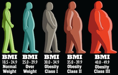
The first is that the indicator of obesity is the BMIand there are several criticisms of that indicator. I know nothing about nutrition so I will stop right here and move on.
The second is that is uses the mean BMI for each country. “So what?” might the average Joe ask. Well, the problem is that the arithmetic mean is a measure of central tendency that can be misleading. If there are more people on one end of the distribution, the mean is skewed … and therefore another measure of central tendency might be better (like the median). Moreover, the mean considers population size … so a small number of outliers (whales in our case) will impact the mean in a country with a smaller population than a larger one.
Lets do the numbers
So instead of bemoaning the beautiful infographics and extensive studies … lets take a look at the figures ourselves … use R!
We can find some information about the BMI by gender in the World Health Organization’s database. The data sets used show the proportion of a population that is over a certain BMI bracket. This is great, it over comes the issues with the averages we already discussed.
Since we are dealing with obesity, we want to download the data sets labelled:
Download the files into a working directory and lets get started!
Conclusions First!
Let us take a look at the results before we get into the code. You can find all three plots that we’re going to make side by side here.
Round 1: Adult
Lets first look at the % of adults that are obese in every population. We can see comes in position 13 after the USA, UAE, Saudi Arabia, Egypt, Bahrain, and the rest.
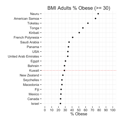
This means that, given the population of Kuwait, the ratio of obese people is less than the same ratio in 12 other countries. Is this good news? We’re still in the top 20! … but we’re not #1 (yet)
Round 2: Males
So the men had a great chuckle at these statistics I’m sure … well lets see hour our brothers at the sufra are doing. Proportionally, they are about the same as the general population: 29% … except they rank 10th now because as a ratio, our men weigh in heavier.

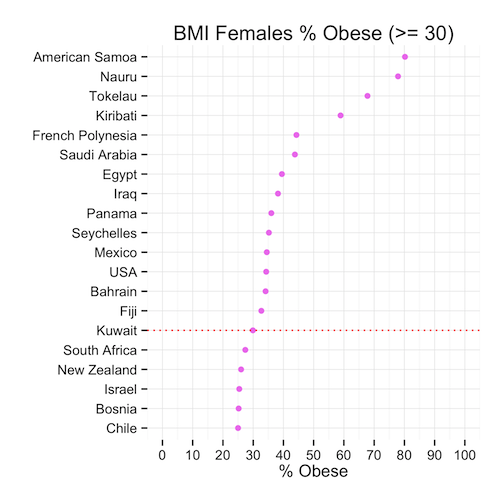
Round 3: Moment of truth, Ladies
Immediately we can see that the heavy set ladies in Kuwait are not #1 in the world (awww!) In fact, they are ranked in the 15th position – lower than the men and the general population. The proportion of females that are obese is only slightly higher than that of men.
So we can conclude that, although the mean might show that Kuwait is #1 in the world, this is far from the truth when we look at the proportions that might in fact be a more representative indicator of spread and centrality of BMI.
Time for a cookie?
The Code
Lets look at how we produced the graphs. If you haven’t already, download the data sets (here or from the WHO’s website):
Now read this data intro R:
# Read Data obese.adults<-read.csv(file="BMIadults%obese(-=30.0).csv",stringsAsFactors=F) obese.male<-read.csv(file="BMImales%obese(-=30.0).csv",stringsAsFactors=F) obese.female<-read.csv(file="BMIfemales%obese(-=30.0).csv",stringsAsFactors=F) |
Great! We will need a few libraries so lets get those loaded:
# Load Libraries library(gridExtra) library(reshape) library(ggplot2) |
Now we want to play with our data before we can plot it.
We will pick the top 20 countries ordered by BMI value and create each plot accordingly.
# Select Top X Countries topx<-20 # Create Plot 1: % Adults Obese # Melt the data p1<-melt(obese.adults) # Select only the most recent data p1<-p1[p1$variable == "Most.recent",] # Sort the data p1<-p1[order(p1$value,decreasing=T),] # Remove any empty rows p1<-p1[!is.na(p1$value),] # Select Top X countries p1<-head(p1,topx) # Find Kuwait in the Top X Countries to highlight kuwait<-nrow(p1)-which(reorder(p1$"country...year",p1$value)=="Kuwait",T,T)+1 plot1<-ggplot(data=p1,aes(y=reorder(p1$"country...year",p1$value),x=p1$value))+ geom_point(color=I("black"))+ ylab("")+xlab("% Obese")+ggtitle("BMI Adults % Obese (>= 30)")+ scale_x_continuous(limits = c(0, 100), breaks = seq(0, 100, 10))+ theme_minimal()+ geom_hline(yintercept=kuwait,linetype="dotted",colour="red") |
That was the first plot, and now we repeat this 2 more times
# Create Plot 2: Females % Obese p2<-melt(obese.female) p2<-p2[p2$variable == "Most.recent",] p2<-p2[order(p2$value,decreasing=T),] p2<-p2[!is.na(p2$value),] p2<-head(p2,topx) kuwait<-nrow(p2)-which(reorder(p2$"country...year",p2$value)=="Kuwait",T,T)+1 plot2<-ggplot(data=p2,aes(y=reorder(p2$"country...year",p2$value),x=p2$value))+ geom_point(color=I("violet"))+ ylab("")+xlab("% Obese")+ggtitle("BMI Females % Obese (>= 30)")+ scale_x_continuous(limits = c(0, 100), breaks = seq(0, 100, 10))+ theme_minimal()+ geom_hline(yintercept=kuwait,linetype="dotted",colour="red") |
Finally Plot 3
# Create Plot 1: % Male Obese p3<-melt(obese.male) p3<-p3[p3$variable == "Most.recent",] p3<-p3[order(p3$value,decreasing=T),] p3<-p3[!is.na(p3$value),] p3<-head(p3,topx) kuwait<-nrow(p3)-which(reorder(p3$"country...year",p3$value)=="Kuwait",T,T)+1 plot3<-ggplot(data=p3,aes(y=reorder(substring(p3$"country...year",first=0,last=20),p3$value),x=p3$value))+ geom_point(color=I("blue"))+ ylab("")+xlab("% Obese")+ggtitle("BMI Males % Obese (>= 30)")+ scale_x_continuous(limits = c(0, 100), breaks = seq(0, 100, 10))+ theme_minimal()+ geom_hline(yintercept=kuwait,linetype="dotted",colour="red") |
Lastly, we want to create our 3 plots in one image so we use the gridExtra library here:
grid.arrange(plot1,plot2,plot3) |
That’s it! You can download the entire code here:
Obesity.R
Next Steps
I will probably do a follow on this post by looking at reasons why obesity might be such an issue in Kuwait. Namely, I will look at consumption patterns among gender groups. Keep in mind, I do this to practice R and less so to do some sort of ground breaking study … most of this stuff can be done with a pen and paper.
References
AHealthBlog.com – BMI Calculator for Women and Men


Pingback: Overweight in Kuwait – Food Supply with R : Salem Marafi
Pingback: Why we die – Mortality in Kuwait with R : Salem Marafi