![]() Jan 19
Jan 19

Diving into Data – An SQL Course on Udemy by MBASQL.com

An interactive SQL learning experience
We run a micro-courses business, Afterskills, to help professionals ramp up their skills on specific and technical topics.
One of our products, MBASQL, is designed to help MBA’s, Business Analysts, and other professionals in Marketing, Online Fashion, and E-Commerce ramp up their skills with Data.
Today, we launched that course online through Udemy.com
Course Description
Our course is designed to equip MBAs & professionals with the skills required to extract data from relational databases. Most importantly, students will learn how to use data to bring insight into their decision making process through the lens of commercial problems faced by leading e-commerce businesses.
To assist in your learning, you will gain access to our very own:
- order Soma WITHOUT SCRIPT Simulated web store having the same functionality as all e-commerce businesses.
- follow Rich database of customer & product information that you’ll be able to browse.
- here SQL platform to take what you’ve learned & turn that into your very own SQL code.
Start Learning SQL with MBASQL.com
The class can be found here:
https://www.udemy.com/mbasql-diving-into-data/
The first 100 students can get a 50% discount by using the coupon code see “MBASQL-FRIEND”
https://www.turtleopticians.com/locations/ Please leave a review if you do take the course!
Thanks!!
![]() Posted by Salem
Posted by Salem
![]() Aug 8
Aug 8

Recursively rename files to their parent folder’s name

If you own a business and sell online, you will have had to – at some point or another – name a whole bunch of images in a specific way to stay organised. If you sell on behalf of brands, naming your images is even more important.
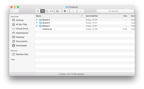
Problem: Lets say you had your images sorted in a bunch of folders. Each folder had the name of the brand with the brand’s images in the folder. To make it more complicated, a brand could have a sub-brand, and therefore a subfolder with that sub-brand’s images.
This looks like this in practice:

I was surprised at how difficult this was to accomplish. After scouring stack overflow for solutions that do something close, I came up with the solution presented here.
We will be using Python’s os library. First lets create a function that takes 2 parameters:
- The top-most folder that contains all the files and subfolders.
- A number indicating how many folders deep do we want to go
This look like this:
def renameFiles(path, depth=99): |
We will be calling this function recursively (over and over) until we are as deep as we want to go. For every folder deep we go, we want to reduce the depth by one. If we hit 0, then we know to go back up the folder tree. Lets continue building our code:
def renameFiles(path, depth=99): if depth < 0: return |
Now for every file we hit, we want to test for a few things:
- That the path to that file is not a shortcut or symbolic link
- That the path to the file is a real folder and exists
- If the file we look at is a real folder, we go one level deep
To do this we add the following code:
def renameFiles(path, depth=99): # Once we hit depth, return if depth < 0: return # Make sure that a path was supplied and it is not a symbolic link if os.path.isdir(path) and not os.path.islink(path): # We will use a counter to append to the end of the file name ind = 1 # Loop through each file in the start directory and create a fullpath for file in os.listdir(path): fullpath = path + os.path.sep + file # Again we don't want to follow symbolic links if not os.path.islink(fullpath): # If it is a directory, recursively call this function # giving that path and reducing the depth. if os.path.isdir(fullpath): renameFiles(fullpath, depth - 1) |
We are now ready to process a file that we find in a folder. We want to first build a new name for the file then test for a few things before renaming the file.
- That we are only changing image files
- We are not overwriting an existing file
- That we are in the correct folder
Once we are sure that these tests pass, we can rename the file and complete the function. Your function is then complete:
import os ''' Function: renameFiles Parameters: @path: The path to the folder you want to traverse @depth: How deep you want to traverse the folder. Defaults to 99 levels. ''' def renameFiles(path, depth=99): # Once we hit depth, return if depth < 0: return # Make sure that a path was supplied and it is not a symbolic link if os.path.isdir(path) and not os.path.islink(path): # We will use a counter to append to the end of the file name ind = 1 # Loop through each file in the start directory and create a fullpath for file in os.listdir(path): fullpath = path + os.path.sep + file # Again we don't want to follow symbolic links if not os.path.islink(fullpath): # If it is a directory, recursively call this function # giving that path and reducing the depth. if os.path.isdir(fullpath): renameFiles(fullpath, depth - 1) else: # Find the extension (if available) and rebuild file name # using the directory, new base filename, index and the old extension. extension = os.path.splitext(fullpath)[1] # We are only interested in changing names of images. # So if there is a non-image file in there, we want to ignore it if extension in ('.jpg','.jpeg','.png','.gif'): # We want to make sure that we change the directory we are in # If you do not do this, you will not get to the subdirectory names os.chdir(path) # Lets get the full path of the files in question dir_path = os.path.basename(os.path.dirname(os.path.realpath(file))) # We then define the name of the new path in order # The full path, then a dash, then 2 digits, then the extension newpath = os.path.dirname(fullpath) + os.path.sep + dir_path \ + ' - '+"{0:0=2d}".format(ind) + extension # If a file exists in the new path we defined, we probably do not want # to over write it. So we will redefine the new path until we get a unique name while os.path.exists(newpath): ind +=1 newpath = os.path.dirname(fullpath) + os.path.sep + dir_path \ + ' - '+"{0:0=2d}".format(ind) + extension # We rename the file and increment the sequence by one. os.rename(fullpath, newpath) ind += 1 return |
The last part is to add a line outside the function that executes it in the directory where the python file lives:
renameFiles(os.getcwd()) |
With this your code is complete. You can copy the code at the bottom of this post.
How do you use this?
Once you have the file saved. Drop it in the folder of interest. In the image below, we have the file rename.py in the top most folder.
Next, you fire up terminal and type in “cd” followed by the folder where you saved your python script. Then type in “python” followed by the name of the python file you saved. In our case it is rename.py:
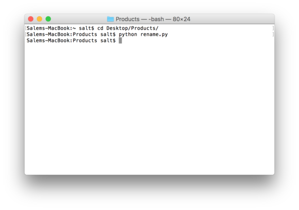
The results look like this:

The entire code
import os ''' Function: renameFiles Parameters: @path: The path to the folder you want to traverse @depth: How deep you want to traverse the folder. Defaults to 99 levels. ''' def renameFiles(path, depth=99): # Once we hit depth, return if depth < 0: return # Make sure that a path was supplied and it is not a symbolic link if os.path.isdir(path) and not os.path.islink(path): # We will use a counter to append to the end of the file name ind = 1 # Loop through each file in the start directory and create a fullpath for file in os.listdir(path): fullpath = path + os.path.sep + file # Again we don't want to follow symbolic links if not os.path.islink(fullpath): # If it is a directory, recursively call this function # giving that path and reducing the depth. if os.path.isdir(fullpath): renameFiles(fullpath, depth - 1) else: # Find the extension (if available) and rebuild file name # using the directory, new base filename, index and the old extension. extension = os.path.splitext(fullpath)[1] # We are only interested in changing names of images. # So if there is a non-image file in there, we want to ignore it if extension in ('.jpg','.jpeg','.png','.gif'): # We want to make sure that we change the directory we are in # If you do not do this, you will not get to the subdirectory names os.chdir(path) # Lets get the full path of the files in question dir_path = os.path.basename(os.path.dirname(os.path.realpath(file))) # We then define the name of the new path in order # The full path, then a dash, then 2 digits, then the extension newpath = os.path.dirname(fullpath) + os.path.sep + dir_path \ + ' - '+"{0:0=2d}".format(ind) + extension # If a file exists in the new path we defined, we probably do not want # to over write it. So we will redefine the new path until we get a unique name while os.path.exists(newpath): ind +=1 newpath = os.path.dirname(fullpath) + os.path.sep + dir_path \ + ' - '+"{0:0=2d}".format(ind) + extension # We rename the file and increment the sequence by one. os.rename(fullpath, newpath) ind += 1 return renameFiles(os.getcwd()) |
![]() Posted by Salem
Posted by Salem
![]() Apr 28
Apr 28

Collaborative Filtering with Python
To start, I have to say that it is really heartwarming to get feedback from readers, so thank you for engagement. This post is a response to a request made collaborative filtering with R.
The approach used in the post required the use of loops on several occassions.
Loops in R are infamous for being slow. In fact, it is probably best to avoid them all together.
One way to avoid loops in R, is not to use R (mind: #blow). We can use Python, that is flexible and performs better for this particular scenario than R.
For the record, I am still learning Python. This is the first script I write in Python.
Refresher: The Last.FM dataset
The data set contains information about users, gender, age, and which artists they have listened to on Last.FM.
In our case we only use Germany’s data and transform the data into a frequency matrix.
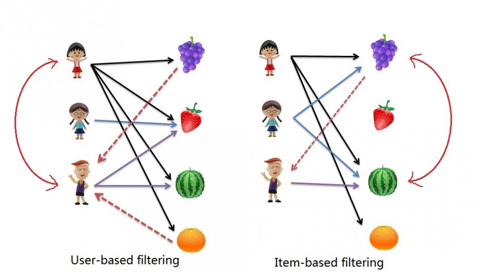
We will use this to complete 2 types of collaborative filtering:
- Item Based: which takes similarities between items’ consumption histories
- User Based: that considers similarities between user consumption histories and item similarities
We begin by downloading our dataset:
Fire up your terminal and launch your favourite IDE. I use IPython and Notepad++.
Lets load the libraries we will use for this exercise (pandas and scipy)
# --- Import Libraries --- # import pandas as pd from scipy.spatial.distance import cosine |
We then want to read our data file.
# --- Read Data --- # data = pd.read_csv('data.csv') |
If you want to check out the data set you can do so using data.head():
data.head(6).ix[:,2:8] abba ac/dc adam green aerosmith afi air 0 0 0 0 0 0 0 1 0 0 1 0 0 0 2 0 0 0 0 0 0 3 0 0 0 0 0 0 4 0 0 0 0 0 0 5 0 0 0 0 0 0 |
Item Based Collaborative Filtering
Reminder: In item based collaborative filtering we do not care about the user column.
So we drop the user column (don’t worry, we’ll get them back later)
# --- Start Item Based Recommendations --- # # Drop any column named "user" data_germany = data.drop('user', 1) |
Before we calculate our similarities we need a place to store them. We create a variable called data_ibs which is a Pandas Data Frame (… think of this as an excel table … but it’s vegan with super powers …)
# Create a placeholder dataframe listing item vs. item data_ibs = pd.DataFrame(index=data_germany.columns,columns=data_germany.columns) |
Now we can start to look at filling in similarities. We will use Cosin Similarities.
We needed to create a function in R to achieve this the way we wanted to. In Python, the Scipy library has a function that allows us to do this without customization.
In essense the cosine similarity takes the sum product of the first and second column, then dives that by the product of the square root of the sum of squares of each column.
This is a fancy way of saying “loop through each column, and apply a function to it and the next column”.
# Lets fill in those empty spaces with cosine similarities # Loop through the columns for i in range(0,len(data_ibs.columns)) : # Loop through the columns for each column for j in range(0,len(data_ibs.columns)) : # Fill in placeholder with cosine similarities data_ibs.ix[i,j] = 1-cosine(data_germany.ix[:,i],data_germany.ix[:,j]) |
With our similarity matrix filled out we can look for each items “neighbour” by looping through ‘data_ibs’, sorting each column in descending order, and grabbing the name of each of the top 10 songs.
# Create a placeholder items for closes neighbours to an item data_neighbours = pd.DataFrame(index=data_ibs.columns,columns=range(1,11)) # Loop through our similarity dataframe and fill in neighbouring item names for i in range(0,len(data_ibs.columns)): data_neighbours.ix[i,:10] = data_ibs.ix[0:,i].order(ascending=False)[:10].index # --- End Item Based Recommendations --- # |
Done!
data_neighbours.head(6).ix[:6,2:4] 2 3 4 a perfect circle tool dredg deftones abba madonna robbie williams elvis presley ac/dc red hot chili peppers metallica iron maiden adam green the libertines the strokes babyshambles aerosmith u2 led zeppelin metallica afi funeral for a friend rise against fall out boy |
User Based collaborative Filtering
The process for creating a User Based recommendation system is as follows:
- Have an Item Based similarity matrix at your disposal (we do…wohoo!)
- Check which items the user has consumed
- For each item the user has consumed, get the top X neighbours
- Get the consumption record of the user for each neighbour.
- Calculate a similarity score using some formula
- Recommend the items with the highest score
Lets begin.
We first need a formula. We use the sum of the product 2 vectors (lists, if you will) containing purchase history and item similarity figures. We then divide that figure by the sum of the similarities in the respective vector.
The function looks like this:
# --- Start User Based Recommendations --- # # Helper function to get similarity scores def getScore(history, similarities): return sum(history*similarities)/sum(similarities) |
The rest is a matter of applying this function to the data frames in the right way.
We start by creating a variable to hold our similarity data.
This is basically the same as our original data but with nothing filled in except the headers.
# Create a place holder matrix for similarities, and fill in the user name column data_sims = pd.DataFrame(index=data.index,columns=data.columns) data_sims.ix[:,:1] = data.ix[:,:1] |
We now loop through the rows and columns filling in empty spaces with similarity scores.
Note that we score items that the user has already consumed as 0, because there is no point recommending it again.
#Loop through all rows, skip the user column, and fill with similarity scores for i in range(0,len(data_sims.index)): for j in range(1,len(data_sims.columns)): user = data_sims.index[i] product = data_sims.columns[j] if data.ix[i][j] == 1: data_sims.ix[i][j] = 0 else: product_top_names = data_neighbours.ix[product][1:10] product_top_sims = data_ibs.ix[product].order(ascending=False)[1:10] user_purchases = data_germany.ix[user,product_top_names] data_sims.ix[i][j] = getScore(user_purchases,product_top_sims) |
We can now produc a matrix of User Based recommendations as follows:
# Get the top songs data_recommend = pd.DataFrame(index=data_sims.index, columns=['user','1','2','3','4','5','6']) data_recommend.ix[0:,0] = data_sims.ix[:,0] |
Instead of having the matrix filled with similarity scores, however, it would be nice to see the song names.
This can be done with the following loop:
# Instead of top song scores, we want to see names for i in range(0,len(data_sims.index)): data_recommend.ix[i,1:] = data_sims.ix[i,:].order(ascending=False).ix[1:7,].index.transpose() |
# Print a sample print data_recommend.ix[:10,:4] |
Done! Happy recommending ;]
user 1 2 3 0 1 flogging molly coldplay aerosmith 1 33 red hot chili peppers kings of leon peter fox 2 42 oomph! lacuna coil rammstein 3 51 the subways the kooks franz ferdinand 4 62 jack johnson incubus mando diao 5 75 hoobastank papa roach sum 41 6 130 alanis morissette the smashing pumpkins pearl jam 7 141 machine head sonic syndicate caliban 8 144 editors nada surf the strokes 9 150 placebo the subways eric clapton 10 205 in extremo nelly furtado finntroll |
Entire Code
# --- Import Libraries --- # import pandas as pd from scipy.spatial.distance import cosine # --- Read Data --- # data = pd.read_csv('data.csv') # --- Start Item Based Recommendations --- # # Drop any column named "user" data_germany = data.drop('user', 1) # Create a placeholder dataframe listing item vs. item data_ibs = pd.DataFrame(index=data_germany.columns,columns=data_germany.columns) # Lets fill in those empty spaces with cosine similarities # Loop through the columns for i in range(0,len(data_ibs.columns)) : # Loop through the columns for each column for j in range(0,len(data_ibs.columns)) : # Fill in placeholder with cosine similarities data_ibs.ix[i,j] = 1-cosine(data_germany.ix[:,i],data_germany.ix[:,j]) # Create a placeholder items for closes neighbours to an item data_neighbours = pd.DataFrame(index=data_ibs.columns,columns=[range(1,11)]) # Loop through our similarity dataframe and fill in neighbouring item names for i in range(0,len(data_ibs.columns)): data_neighbours.ix[i,:10] = data_ibs.ix[0:,i].order(ascending=False)[:10].index # --- End Item Based Recommendations --- # # --- Start User Based Recommendations --- # # Helper function to get similarity scores def getScore(history, similarities): return sum(history*similarities)/sum(similarities) # Create a place holder matrix for similarities, and fill in the user name column data_sims = pd.DataFrame(index=data.index,columns=data.columns) data_sims.ix[:,:1] = data.ix[:,:1] #Loop through all rows, skip the user column, and fill with similarity scores for i in range(0,len(data_sims.index)): for j in range(1,len(data_sims.columns)): user = data_sims.index[i] product = data_sims.columns[j] if data.ix[i][j] == 1: data_sims.ix[i][j] = 0 else: product_top_names = data_neighbours.ix[product][1:10] product_top_sims = data_ibs.ix[product].order(ascending=False)[1:10] user_purchases = data_germany.ix[user,product_top_names] data_sims.ix[i][j] = getScore(user_purchases,product_top_sims) # Get the top songs data_recommend = pd.DataFrame(index=data_sims.index, columns=['user','1','2','3','4','5','6']) data_recommend.ix[0:,0] = data_sims.ix[:,0] # Instead of top song scores, we want to see names for i in range(0,len(data_sims.index)): data_recommend.ix[i,1:] = data_sims.ix[i,:].order(ascending=False).ix[1:7,].index.transpose() # Print a sample print data_recommend.ix[:10,:4] |
Referenence
- This case is based on Professor Miguel Canela’s “Designing a music recommendation app”
![]() Posted by Salem
Posted by Salem
![]() Feb 8
Feb 8

Counting Tweets in R – Substrings, Chaining, and Grouping

I was recently sent an email about transforming tweet data and presenting it in a simple way to represent stats about tweets by a certain category. I thought I would share how to do this:
A tweet is basically composed of text, hash tags (text prefixed with #), mentions (text prefixed with @), and lastly hyperlinks (text that follow some form of the pattern “http://_____.__”). We want to count these by some grouping – in this case we will group by user/character.
I prepared a sample data set containing some made up tweets by Sesame Street characters. You can download it by clicking: Sesame Street Faux Tweets.
Fire up R then load up our tweets into a dataframe:
# Load tweets and convert to dataframe tweets<-read.csv('sesamestreet.csv', stringsAsFactors=FALSE) tweets <- as.data.frame(tweets) |
We will use 3 libraries: stringr for string manipulation, dplyr for chaining, and ggplot2 for some graphs.
# Libraries library(dplyr) library(ggplot2) library(stringr) |
We now want to create the summaries and store them in a list or dataframe of their own. We will use dplyr to do the grouping, and stringr with some regex to apply filters on our tweets. If you do not know what is in the tweets dataframe go ahead and run head(tweets) to get an idea before moving forward.
gluten <- tweets %>% group_by(character) %>% summarise(total=length(text), hashtags=sum(str_count(text,"#(\\d|\\w)+")), mentions=sum(str_count(text,"@(\\d|\\w)+")), urls=sum(str_count(text,"^(([^:]+)://)?([^:/]+)(:([0-9]+))?(/.*)")) ) |
The code above starts with the variable we will store our list in … I called it “gluten” for no particular reason.
- We will apply transformations to our tweets dataframe. The “dplyr” knows to step into the next command because we use “%>%” to indicate this.
- We group by the first column “character” using the function group_by().
- We then create summary stats by using the function summarise() – note the American spelling will work too 😛
- We create a summary called total which is equal to the number of tweets (i.e. length of the list that has been grouped)
- We then count the hashtags by using the regex expression “#(\\d|\\w)+” and the function str_count() from the stringr package. If this regex does not make sense, you can use many tools online to explain it.
- We repeat the same step for mentions and urls
Phew. Now lets see what that outputs by typing “gluten” into the console:
character total hashtags mentions urls 1 Big Bird 2 5 1 0 2 Cookie Monster 3 2 1 1 3 Earnie & Bert 4 0 4 0 |
Which is exactly what we would see if we opened up the CSV file.
We can now create simple plots using the following code:
# Plots ggplot(data=gluten)+aes(x=reorder(character,-total),y=total)+geom_bar(stat="identity") +theme(axis.text.x = element_text(angle = 90, hjust = 1))+ylab("Tweets")+xlab("Character")+ggtitle("Characters Ranked by Total Tweets") ggplot(data=gluten)+aes(x=reorder(character,-hashtags),y=hashtags)+geom_bar(stat="identity") +theme(axis.text.x = element_text(angle = 90, hjust = 1))+ylab("Tweets")+xlab("Character")+ggtitle("Characters Ranked by Total Hash Tags") ggplot(data=gluten)+aes(x=reorder(character,-mentions),y=mentions)+geom_bar(stat="identity") +theme(axis.text.x = element_text(angle = 90, hjust = 1))+ylab("Tweets")+xlab("Character")+ggtitle("Characters Ranked by Total Mentions") ggplot(data=gluten)+aes(x=reorder(character,-urls),y=urls)+geom_bar(stat="identity") +theme(axis.text.x = element_text(angle = 90, hjust = 1))+ylab("Tweets")+xlab("Character")+ggtitle("Characters Ranked by Total URLs ") |
Admittedly they’re not the prettiest plots, I got lazy ^_^’
Enjoy! If you have any questions, leave a comment!!
![]() Posted by Salem
Posted by Salem
![]() Jun 11
Jun 11

Why we die – Mortality in Kuwait with R

I came across Randy Olson’s (editor at @DataIsBeautiful) tweet about causes of death in the US.
I thought I would replicate the information here using R and localize it for Kuwait – nothing fancy.
I will keep the code to the end because I think the results are quite interesting. The data source is from the UN Data portal
Here’s Randy Olson’s Tweet before we get going:
Less misleading remake of "How we #Die: Comparing the causes of death in 1900 vs. 2010." #health #dataviz pic.twitter.com/xw0AJ5tYRA
— Randy Olson (@randal_olson) June 9, 2014
Causes of Death in the General Population
I always had the impression that the biggest issues with mortality in Kuwait were car accidents. Perhaps this is a bias introduced by media coverage. I always thought that if someone managed to survive their entire lives in Kuwait without dying in an accident, then only one other thing could get them ~ and that was cancer. This is not far from the truth:
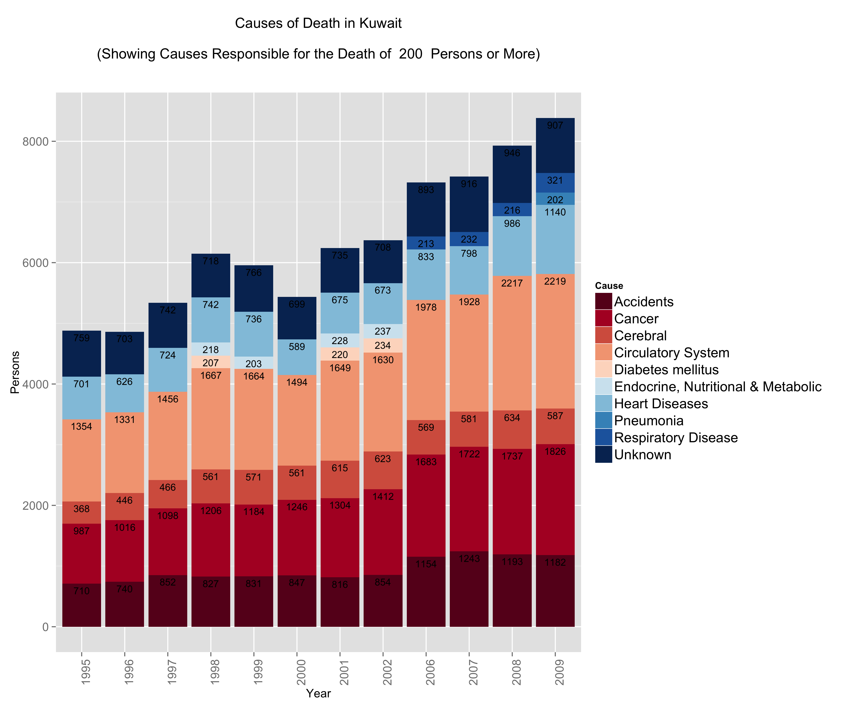
What did catch me off guard is the number of people who die from circulatory system disease and heart disease. The numbers are not only large, but the trump both accidents and cancer figures. Interestingly enough, respiratory system diseases start to show up in 2006 just as problems with circulatory and pulmonary problems become more prevalent.
I thought that this surely is controlled within a demographic group.
So I decided to split the data into gender and age.
Causes of Death by Gender
Looking at the gender differences the first eye-popping fact is that less women seem to be dying … this is misleading because the population is generally bias towards men. There are about 9 men for every 5 women in Kuwait.

The other eye-popping item that appears is in accidents. Less women pass away from accidents compared to men – a lot less! Is this indicative that women are safer drivers than their counterparts? Perhaps. In some nations this figure would indeed be zero because of social and legal constraints … it’s not necessarily good news … but it does stand out!
Proportionally there is a higher rate of mortality due to cancer in the female population vs. the male population.
Lastly, men seem to be more susceptible to death from heart diseases and circulatory system diseases. This might make you think why? Heart diseases and circulatory system diseases are exacerbated by sedentry life styles, poor diets, and other factors such as the consumption of tobacco. We have already looked at obesity in Kuwait … perhaps a deeper dive might shed some light on this matter.
For now, lets move on … surely younger people do not suffer from heart diseases …
Causes of Death by Age Group
This one confirms that if an accident does not get you before you’re 25 then the rest of the diseases are coming your way.
People fall victim to circulatory, respiratory, and heart diseases at extremely young ages. In fact what we see here is that irrespective of age group, after the age of 40 the mortality rates are the same for these three diseases.
On the other hand, accident mortalities go down as people shift to older age groups but are displaced by cancer. What is terribly depressing about this graph are the number of people below the ages of 19 that die in accidents. These might be just numbers, but in reality these are very real names to families.

Take-aways
The graphs were just a fun way to play with R. What we can take away is that of the 5 main causes for mortality in Kuwait – Cancer, Heart Diseases, Circulatory Diseases, Respiratory Diseases, and Accidents – 4 of them are addressible through policy, regulation, and raising public awareness for social/behavioural impact.
Code
You can download the Kuwait dataset here or from the UN’s Data Portal.
Load up R and run the code below – fully commented for your geeky enjoyment:
# In Libraries we Trust library(ggplot2) library(dplyr) # Read Data data.mortality<-read.csv('kuwait.csv') ################## # Data Munging # ################## # Change Year into a categorical variable data.mortality$Year<-as.factor(data.mortality$Year) # Rename our columns names(data.mortality)<-c("Country","Year","Area","Sex","Age","Cause","Record","Reliability","Source.Year","Value","Value.Notes") # Data cleaning, here we groups some items together for simplification. # Eg. All forms of neoplasms are grouped under "Cancer". data.mortality$Cause<-gsub(pattern=", ICD10","",x=data.mortality$Cause) data.mortality[grep(pattern="eoplasm",x=data.mortality$Cause),]$Cause<-"Cancer" data.mortality[grep(pattern="ccidents",x=data.mortality$Cause),]$Cause<-"Accidents" data.mortality[grep(pattern="not elsewhere classified",x=data.mortality$Cause),]$Cause<-"Unknown" data.mortality[grep(pattern="External causes",x=data.mortality$Cause),]$Cause<-"Unknown" data.mortality[grep(pattern="Congenital malformations",x=data.mortality$Cause),]$Cause<-"Congenital malformations" data.mortality[grep(pattern="Certain conditions originating in the perinatal period",x=data.mortality$Cause),]$Cause<-"Perinatal period conditions" data.mortality[grep(pattern="Endocrine, nutritional and metabolic",x=data.mortality$Cause),]$Cause<-"Endocrine, Nutritional & Metabolic" data.mortality[grep(pattern="Diseases of the respiratory",x=data.mortality$Cause),]$Cause<-"Respiratory Disease" data.mortality[grep(pattern="Diseases of the circulatory system",x=data.mortality$Cause),]$Cause<-"Circulatory System" data.mortality[grep(pattern="Hypertensive diseases",x=data.mortality$Cause),]$Cause<-"Cerebral" data.mortality[grep(pattern="Ischaemic heart diseases",x=data.mortality$Cause),]$Cause<-"Heart Diseases" data.mortality[grep(pattern="Cerebrovascular diseases",x=data.mortality$Cause),]$Cause<-"Cerebral" ######################### # Data Transformations # ######################### # Use the dplyr library to group items from the original data set # We want a general understanding of causes of death # We subset out All causes to avoid duplication # We subset out age groups that cause duplication # We group by Country, Year and Cause # We create a summary variable "Persons" that is the sum of the incidents # We sort by Cause for pretty graphs kw.general <- data.mortality %.% subset(!(Cause %in% "All causes")) %.% subset(Country %in% "Kuwait") %.% subset(!(Age %in% c("Total","Unknown","85 +","95 +","1","2","3","4","0"))) %.% group_by(Country) %.% group_by(Year) %.% group_by(Cause) %.% summarise(Persons=sum(Value)) %.% arrange(Cause) # We want an understanding of causes of death by age group # We subset out All causes to avoid duplication # We subset out age groups that cause duplication # We group by Country, Year, Age and Cause # We create a summary variable "Persons" that is the sum of the incidents # We sort by Cause for pretty graphs kw.age<-data.mortality %.% subset(!(Cause %in% "All causes")) %.% subset(Country %in% "Kuwait") %.% subset(!(Age %in% c("Total","Unknown","85 +","95 +","1","2","3","4","0"))) %.% group_by(Country) %.% group_by(Year) %.% group_by(Age) %.% group_by(Cause) %.% summarise(Persons=sum(Value)) %.% arrange(Cause) # We reorder our age groups manually for pretty graphs kw.age$Age<-(factor(kw.age$Age,levels(kw.age$Age)[c(1,2,6,9,12,3,15,4,5,7,8,10,11,13,14,16:28)])) # We want an understanding of causes of death by gender # We subset out All causes to avoid duplication # We subset out age groups that cause duplication # We group by Country, Year, Gender and Cause # We create a summary variable "Persons" that is the sum of the incidents # We sort by Cause for pretty graphs kw.sex<-data.mortality %.% subset(!(Cause %in% "All causes")) %.% subset(Country %in% "Kuwait") %.% subset(!(Age %in% c("Total","Unknown","85 +","95 +","1","2","3","4","0"))) %.% group_by(Country) %.% group_by(Year) %.% group_by(Sex) %.% group_by(Cause) %.% summarise(Persons=sum(Value)) %.% arrange(Cause) ######################################## # Graphing, Plotting, Dunking Cookies # ######################################## # We will limit our graphs by number of persons each incidents cause # The main reason is because we do not want a graph that looks like a chocolate chip cookie PersonLimit <- 200 # Plot the General data General<-ggplot(subset(kw.general,Persons>=PersonLimit), aes(x = Year, y = Persons)) + geom_bar(aes(fill=Cause),stat='identity', position="stack")+ ggtitle(paste("Causes of Death in Kuwait\n\n(Showing Causes Responsible for the Death of ",PersonLimit," Persons or More)\n\n"))+ theme(axis.text.x = element_text(angle = 90, hjust = 1), legend.text=element_text(size=14), axis.text=element_text(size=12), axis.title=element_text(size=12))+ scale_fill_brewer( palette = "RdBu")+ geom_text(aes(label = Persons,y=Persons,ymax=Persons), size = 3.5, vjust = 1.5, position="stack",color=I("#000000")) # Reset the Person Limit PersonLimit <- 150 # Plot the Gender data faceted by Gender Gender<-ggplot(subset(kw.sex,Persons>=PersonLimit), aes(x = Year, y = Persons)) + geom_bar(aes(fill=Cause),stat='identity', position="stack")+ facet_wrap(~Sex)+ ggtitle(paste("Causes of Death in Kuwait by Gender\n\n(Showing Causes Responsible for the Death of ",PersonLimit," Persons or More)\n\n"))+ theme(axis.text.x = element_text(angle = 90, hjust = 1), legend.text=element_text(size=14), axis.text=element_text(size=12), axis.title=element_text(size=12) )+ scale_fill_brewer( palette = "RdBu" )+ geom_text(aes(label = Persons,y=Persons,ymax=Persons), size = 3.5, vjust = 1.5, position="stack",color=I("#000000")) # Reset the Person Limit PersonLimit <- 30 # Plot the Age group data facted by Age Age<-ggplot(subset(kw.age,Persons>=PersonLimit), aes(x = Year, y = Persons)) + geom_bar(aes(fill=Cause),stat='identity', position="stack")+ facet_wrap(~Age)+ ggtitle(paste("Causes of Death in Kuwait by Age Group\n\n(Showing Causes Responsible for the Death of ",PersonLimit," Persons or More)\n\n"))+ theme(axis.text.x = element_text(angle = 90, hjust = 1), legend.text=element_text(size=14), axis.text=element_text(size=12), axis.title=element_text(size=12) )+ scale_fill_brewer( palette = "RdBu" ) # Save all three plots ggsave(filename="General.png",plot=General,width=12,height=10) ggsave(filename="Age.png",plot=Age,width=12,height=10) ggsave(filename="Gender.png",plot=Gender,width=12,height=10) |
![]() Jun 10
Jun 10

Price Elasticity with R

Scenario
We covered Price Elasticity in an accompanying post. In this post we will look at how we can use this information to analyse our own product and cross product elasticity.
The scenario is as follows:
You are the owner of a corner mom and pop shop that sells eggs and cookies. You sometimes put a poster on your storefront advertising either your fresh farm eggs, or your delicious chocolate chip cookies. You are particularly concerned with the sales off eggs – your beautiful farm chicken would be terribly sad if they knew that their eggs were not doing so well.
Over a one month period, you collect information on sales of your eggs and the different prices you set for your product.
Data Time
We are using a modified version of Data Apple‘s data set.
You can download the supermarket data set here. In it you will find:
- follow Sales: the total eggs sold on the given day
- https://tuf-top.com/voc-compliance/ Price Eggs: the price of the eggs on the day
- source url Ad Type: the type of poster – 0 is the egg poster, 1 is the cookie poster.
- https://eternaclinic.com/treatments/ Price Cookies: the price of cookies on the day
Lets fire up R and load up the data
# Load data and output summary stats sales.data<-read.csv('supermarket.csv') #Look at column names and their classes sapply(sales.data,class) |
The output shows each column and its type:
Sales Price.Eggs Ad.Type Price.Cookies "integer" "numeric" "integer" "numeric" |
Since Ad.Type is a categorical variable, lets go ahead and change that and output the summary statistics of our dataset.
# Change Ad Type to factor sales.data$Ad.Type<-as.factor(sales.data$Ad.Type) summary(sales.data) |
From the results we find that:
- Sales of eggs ranged between 18 and 46
- Price of eggs ranged between $3.73 and $4.77
- We showed the egg poster 15 times and the cookies poster 15 times
- Price of cookies ranged between $4 and $4.81
Sales Price.Eggs Ad.Type Price.Cookies Min. :18.0 Min. :3.73 0:15 Min. :4.00 1st Qu.:25.2 1st Qu.:4.35 1:15 1st Qu.:4.17 Median :28.5 Median :4.48 Median :4.33 Mean :30.0 Mean :4.43 Mean :4.37 3rd Qu.:33.8 3rd Qu.:4.67 3rd Qu.:4.61 Max. :46.0 Max. :4.77 Max. :4.81 |
Right now we want to see if we can predict the relationship between Sales of Eggs, and everything else.
Regression … the Granddaddy of Prediction
We now want to run a regression and then do some diagnostics on our model before getting to the good stuff.
We can run the entire regression or add each variable to see the impact on the regression model. Since we have few predictors lets choose the latter option for fun.
# Create models m1<-lm(formula=Sales~Price.Eggs,data=sales.data) m2<-update(m1,.~.+Ad.Type) m3<-update(m2,.~.+Price.Cookies) mtable(m1,m2,m3) |
The results are pasted below. We end up with a model “m3” that has statistically significant predictors. Our model is:
click Sales of Eggs = 137.37 – (16.12)Price.Eggs + 4.15 (Ad.Type) – (8.71)Price.Cookies
We look at our R2 and see that the regression explains 88.6% of the variance in the data. We also have a low mean squared error (2.611) compared to the other models we generated.
We can actually get better results by transforming our independent and dependent variables (e.g. LN(Sales)) but this will suffice for demonstrating how we can use regressions to calculate price elasticity.
Calls: m1: lm(formula = Sales ~ Price.Eggs, data = sales.data) m2: lm(formula = Sales ~ Price.Eggs + Ad.Type, data = sales.data) m3: lm(formula = Sales ~ Price.Eggs + Ad.Type + Price.Cookies, data = sales.data) ------------------------------------------------ m1 m2 m3 ------------------------------------------------ (Intercept) 115.366*** 101.571*** 137.370*** Price.Eggs -19.286*** -16.643*** -16.118*** Ad.Type: 1/0 4.195** 4.147*** Price.Cookies -8.711*** ------------------------------------------------ R-squared 0.722 0.793 0.886 adj. R-squared 0.712 0.778 0.872 sigma 3.924 3.444 2.611 ... ------------------------------------------------ |
Diagnostics
We need to test for the following assumptions whenever we do regression analysis:
1. The relationship is linear
2. The errors have the same variance
3. The errors are independent of each other
4. The errors are normally distributed
First, we can address some of these points by creating plots of the model in R.

The plot on the left shows that the residuals (errors) have no pattern in variance (Good!).
The red line is concerning because it shows some curvature indicating that perhaps the relationshp is not entirely linear (hmmm…).
On the right we see that the errors are acceptably normally distributed (they are around the straight line … Good!).
To generate this plot you can use the R code below:
# Linearity Plots par(mfrow=c(1,2)) plot(m3) # Reset grid par(mfrow=c(1,1)) |
So we want to look deeper into linearity issues. We will look at multi-colinearity first:
# Multi-collinearity library(car) vif(m3) # variance inflation factors sqrt(vif(m3)) > 2 # problem? |
The code above will show if any of the variables have multicolinearity issues that could cause issues with the model’s integrity. Generally we want values less than 2, and we have values of around 1 so we are good on this front.
Price.Eggs Ad.Type Price.Cookies 1.195107 1.189436 1.006566 |
We can generate a CERES plot to assess non-linearity:
# Diagnosis: Nonlinearity crPlots(m3) |
We see that there is definitely some issues with linearity but not to an extent that it is a cause for concern for the purpose of demonstration. So we keep calm, and move on.
Lastly we want to test independence of the residuals using the Durban Watson Test:
# Diagnosis: Non-independence of Errors durbinWatsonTest(m3) |
The output shows that there is no autocorrelation issues in the model:
lag Autocorrelation D-W Statistic p-value 1 0.06348248 1.792429 0.458 Alternative hypothesis: rho != 0 |
So we are clear to move forward with Price Elasticity and Cross Product Price Elasticity!
Price Elasticity
We now have our model:
see Sales of Eggs = 137.37 – (16.12)Price.Eggs + 4.15 (Ad.Type) – (8.71)Price.Cookies
Own Price Elasticity
To calculate Price Elasticity of Demand we use the formula:
PE = (ΔQ/ΔP) * (P/Q)
(ΔQ/ΔP) is determined by the coefficient -16.12 in our regression formula.
To determine (P/Q) we will use the mean Price (4.43) and mean Sales (30).
Therefore we have PE = -16.12 * 4.43/30 = -2.38
This means that an increase in the price of eggs by 1 unit will decrease the sales by 2.38 units.
Cross Price Elasticity
To calculate Cross Price Elasticity of Demand we are essentially looking for how the price of cookies impacts the sales of eggs. So we use the formula:
CPEcookies = (ΔQ/ΔPcookies) * (Pcookies/Q)
We know from our regression that (ΔQ/ΔPcookies) is the coefficient of Price of Cookies (-8.71).
We use the mean price of cookies and mean sales for the rest of the formula giving (4.37/30)
CPEcookies = -8.71 * (4.37/30) = -1.27
This means that an increase in the price of cookies by 1 unit will decrease the sales of eggs by 1.27 units.
Interpretation
We now know that the price of eggs and price of cookies are complementary to one another in this scenario. Since you only sell too products, one explanation could be that people who come in for cookies and eggs would rather get them elsewhere if the price is too high.
Also, it means that if you had to choose between a price cut on cookies or eggs, go with cookies!
Next steps
You are now in an ideal situation where you can run an optimization function to set the right price for both cookies and eggs.
This is out of the scope of this post, but if you’re interested in doing that check out R’s optim() function ~ or leave a comment below 😛
Bonus
Can you figure out what to do with the Ads?
I’ve included some ideas in the complete code below:
################################### # Warm-up ... data and stuff # ################################### # Load data and output summary stats sales.data<-read.csv('supermarket.csv') #Look at column names and their classes sapply(sales.data,class) # Change Ad.Type to factor and print Summary Stats sales.data$Ad.Type<-as.factor(sales.data$Ad.Type) summary(sales.data) #################### # Create Models # #################### # Load required library library(memisc) # Create models m1<-lm(formula=Sales~Price.Eggs,data=sales.data) m2<-update(m1,.~.+Ad.Type) m3<-update(m2,.~.+Price.Cookies) mtable(m1,m2,m3) #################### # DIAGNOSTICS # #################### # Linearity Plots par(mfrow=c(1,2)) plot(m3) par(mfrow=c(1,1)) # Multi-collinearity library(car) vif(m3) # variance inflation factors sqrt(vif(m3)) > 2 # problem? # Diagnosis: Nonlinearity crPlots(m3) # Diagnosis: Non-independence of Errors # We want a D-W Statistic close to 2 durbinWatsonTest(m3) ######################### # Price Elasticity # ######################### # Calculate Price Elasticity PE<-as.numeric(m3$coefficients["Price.Eggs"] * mean(sales.data$Price.Eggs)/mean(sales.data$Sales)) CPEcookies<-as.numeric(m3$coefficients["Price.Cookies"] * mean(sales.data$Price.Cookies)/mean(sales.data$Sales)) # Print Results PE CPEcookies #################################### # BONUS - What about the ads? # #################################### # Subset the data sales.adEggs <- subset(sales.data,Ad.Type==0) sales.adCookies <- subset(sales.data,Ad.Type==1) # Diagnostic on subsets' means and if they are different ... they are. wilcox.test(x=sales.adCookies$Sales,y=sales.adEggs$Sales,exact=F,paired=T) # On average, does the advert for eggs generate higher sales for eggs? mean(sales.adEggs$Sales) >= mean(sales.adCookies$Sales) |
![]() Posted by Salem
Posted by Salem
![]() May 31
May 31

Overweight in Kuwait – Food Supply with R

Disclaimer
I cannot say this enough … I have no idea about nutrition. In fact, if one were to ask me for a dietary plan it would consist of 4 portions of cookies and 20 portions of coffee. The reason I am doing this is to practice and demonstrate how to do some analysis with R on interesting issues.
The Problem: Food! (…delicious)
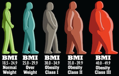
We already looked at the obesity in Kuwait using BMI data. What we found was that indeed, irrespective of gender, Kuwait ranks as one of the top countries with a high proportion of the population deemed obese (BMI >= 30).
The question we did not address is what might be the cause of this obesity. Following in the paths of the WHO’s report on “Diet, food supply, and obesity in the Pacific” (download here) we hope to emulate a very small subset of correlations between the dietary patterns and the prevalence of obesity in Kuwait.
Since this is only a blog post, we will only focus on the macro-nutrient level. Nevertheless, after completing this level we will be well equipped to dive into details with R (feel free to contact me if you want to do this!)
Conclusions First! … Plotting and Stuff
Lets start by plotting a graph to see if we notice any patterns (click it for a much larger image).

What does this graph tell us?
- The black line represents Kuwait figures.
- The red dots represent the average around the world
- The blue bars are top 80% to lower 20% of the observations with the medians marked by a blue diamond.
Lets make some observations about the plot. For brevity we will only highlight things relevant to obesity being mindful of:
- the fact that I know nothing about nutrition
- that there are other interesting things going on in the plot.

source Cereals have been increasing since 1993. This means that the average Kuwaiti consumes more cereals every day than 80% of the persons around the world. The implication is, as explained in Cordain, 1999 that people who consume high amounts of cereals are Purchase Tramadol Without Prescription “affected by disease and dysfunction directly attributable to the consumption of these foods”.

Buy Valium Online Without Prescription Fruits & Starchy Roots both show trends that are below average. Both are important sources of fiber. Fibers help slim you down, but are also important for the prevention of other types of diseases; such as a prevalent one in Kuwaiti males: enter Colorectal cancer.
The consumption of watch vegetables perhaps serves as a balancing factor for this dietary nutrient of which the average Kuwaiti consumes more of compared to 80% of the people around the world.

Purchase Tramadol Vegetable Oils is my favourite … the only thing that stopped the rise of vegetable oil supply in Kuwait was the tragic war of 1990. In 2009 the food supply per capita in Kuwait was well over the 80th percentile in the rest of the world. Vegetable oils not only cause but rather promote obesity. We don’t love Mazola so much anymore now do we?

https://www.ontheballwalkies.com/terms-and-conditions/ Sugars & Sweetners have already made an appearance in another post and here we have more data. The findings are similar, the average Kuwaiti consumes much more sugar than the average person around the world. This not only contributes to obesity but also other diseases such as diabetes.
Data Gathering
So lets get going … where’s the data at?!
The Food and Agriculture Organization of the United Nations have a pretty awesome web portal that contains a lot of rich data. We are interested in data sets concerned with “Food Supply”. Particularly we want to look at:
… because there are only two types of food in the world: Vegetable and Not Vegetable … (cookies are vegetables)
So lets go ahead and download data sets that we want. You will find the selection for Food Supply of Crops. You will want to make sure all fields match:
- Select all countries.
- Use aggregated items
- Leave out grand totals from the aggregated items
- Choose the years you are interested in; I chose 1980 to 2009.
- All checkboxes checked
- Drop-down: output table, no thousands separator, no separator and 2 places for decimals.

Click download and you’re set for Crops!
Now repeat for the Food Supply of Livestock.
Making CSV Files
Now we have 2 XLS files that we can work with. The irony is that these are not excel files at all … they are HTML files
So the first thing we need to do is rename the 2 downloaded folders to “first.html” and “second.html” – it does not matter which one is first or second.
You will notice that the files are huge. So expect the next step to take time.
We will be using the XML library to read the files: first.html and second.html
We know that the files do not contain any headers and we do not want any white spaces.
We will make sure that the data is read into a data frame so we can work with data frame functions.
# Load libraries library(XML) # Read HTML Tables first<-readHTMLTable('first.html',header=F,trim=T,as.data.frame=T) second<-readHTMLTable('second.html',header=F,trim=T,as.data.frame=T) # Make sure that the data is of class data.frame first<-as.data.frame(first) second<-as.data.frame(second) |
We now have our data frames and if we look into the data we can figure out what our headers should be.
So lets rename the headers now:
# Make header names headers<-c("Domain","Country","CountryCode","Item","ItemCode","Element","ElementCode","Year","Unit","Value","Flag","FlagDescription") names(first)<-headers names(second)<-headers |
Great! Now we can finish up by writing CSV files that are smaller in size and faster to read the next time we want to run the analysis:
# Write the CSV file for future use write.csv(first,'first.csv') write.csv(second,'second.csv') |
Data Munging
We are now ready to play with the data. We will be using 2 libraries: dplyr to manage the data and ggplot2 for plotting. Load them up:
# Load libraries library(dplyr) library(ggplot2) |
Lets pretend we are starting from scratch and want to read in the data from the CSV files we created.
You will notice read.csv adds a column so we will also need to rename our headers.
# Read files first<-read.csv('first.csv') second<-read.csv('second.csv') # Set header names headers<-c("ID","Domain","Country","CountryCode","Item","ItemCode","Element","ElementCode","Year","Unit","Value","Flag","FlagDescription") names(first)<-headers names(second)<-headers |
We now want to combine the Livestock and Crops data in the two files. This can be easily done with the rbind() function:
data<-rbind(first,second) |
Great now we need to stop and think about what we want to do with this data.
We want to compare Kuwait’s nutritional information with some sort of summary data about the rest of the world. We can therefore break this up into 2 parts: Kuwait and Other.
Let us deal with Kuwait first and extract the calculated data for grams consumed per capita per day. If you look into the dataset you will know which filters to apply. We will apply those filters using the subset function:
# Extract Kuwait Data data.kuwait<-subset(data,data$Country %in% "Kuwait" & data$"FlagDescription" %in% "Calculated data" & data$"ElementCode" %in% "646") |
Now we want to extract the same information for every other country except Kuwait. That is easy enough, just copy and paste the function from above and :
# Extract Other Countries data data.other<-subset(data,!(data$Country %in% "Kuwait") & data$"FlagDescription" %in% "Calculated data" & data$"ElementCode" %in% "646") |
We need to do a bit more work with the other countries’ data. We said we want summary information and right now we only have raw data for each country. We will use the chaining mechanism in ‘dplyr’ to create summary data such as the mean, median, and upper/lower quantiles. We will group the data by Year and we will then group it by Item (Nutrient).
# Create summary data data.other.summary<- data.other %.% group_by(Year) %.% group_by(Item) %.% summarise(mean=mean(Value), median=median(Value), lowerbound=quantile(Value, probs=.20), upperbound=quantile(Value, probs=.80)) |
This is the same method we used earlier when looking at Sugar grams consumed per capita per day in an earlier post.
Great, our data is ready for some exploration.
GG Plotting and Stuff!
The ggplot code looks like a big ugly hairball … but I will explain it line by line.
# Plot ggplot(data = data.other.summary, aes(x = Year, y=median))+ geom_errorbar(aes(ymin = lowerbound, ymax = upperbound),colour = 'blue', width = 0.4) + stat_summary(fun.y=median, geom='point', shape=5, size=3, color='blue')+ geom_line(data=data.kuwait, aes(Year, Value))+ geom_point(data=data.other.summary, aes(Year, mean),color=I("red"))+ ggtitle('Supply (g/capita/day) - Kuwait vs. World')+ xlab('Year') + ylab('g/capita/day')+ facet_wrap(~Item,scales = "free")+ theme(axis.text.x = element_text(angle = 90, hjust = 1)) |
- Line 1: We start by creating a plot using the data set for the rest of the world and plot median values by year.
- Line 2: We then overlay the blue bars by passing in our summary stats lowerbound and upperbound calculated in the previous step.
- Line 3: We then pass the median values and set the shape to 5 – diamond.
- Line 4: We plot the black line using the Kuwait data set’s values by year.
- Line 5: We plot the averages in red from the rest of the world data set.
- Line 6: We set the title of the graph
- Line 7: We set the labels of the axes
- Line 8: We use the face_wrap() function to tell GG Plot that we want one graph per Item in our data set. We set the scales to “free” so that we get visible graphs (Eggs weigh less than Chicken!)
- Line 9: We set our theme elements – I just changed the angle of the X axis items
Entire Code
# Load libraries library(XML) # Read HTML Tables first<-readHTMLTable('first.html',header=F,trim=T,as.data.frame=T) second<-readHTMLTable('second.html',header=F,trim=T,as.data.frame=T) # Make sure that the data is of class data.frame first<-as.data.frame(first) second<-as.data.frame(second) # Make header names headers<-c("Domain","Country","CountryCode","Item","ItemCode","Element","ElementCode","Year","Unit","Value","Flag","FlagDescription") names(first)<-headers names(second)<-headers # Write the CSV file for future use write.csv(first,'first.csv') write.csv(second,'second.csv') # Load libraries library(dplyr) library(ggplot2) # Read files first<-read.csv('first.csv') second<-read.csv('second.csv') # Set headers for each data frame headers<-c("ID","Domain","Country","CountryCode","Item","ItemCode","Element","ElementCode","Year","Unit","Value","Flag","FlagDescription") names(first)<-headers names(second)<-headers # Combine data frames data<-rbind(first,second) # Check the Element Codes print(unique(data[,c("Element","ElementCode")])) # Extract Kuwait Data data.kuwait<-subset(data,data$Country %in% "Kuwait" & data$"FlagDescription" %in% "Calculated data" & data$"ElementCode" %in% "646") # Extract Other Countries Data data.other<-subset(data,!(data$Country %in% "Kuwait") & data$"FlagDescription" %in% "Calculated data" & data$"ElementCode" %in% "646") # Create summary data data.other.summary<- data.other %.% group_by(Year) %.% group_by(Item) %.% summarise(mean=mean(Value), median=median(Value), lowerbound=quantile(Value, probs=.20), upperbound=quantile(Value, probs=.80)) # Plotting ggplot(data = data.other.summary, aes(x = Year, y=median))+ geom_errorbar(aes(ymin = lowerbound, ymax = upperbound),colour = 'blue', width = 0.4) + stat_summary(fun.y=median, geom='point', shape=5, size=3, color='blue')+ geom_line(data=data.kuwait, aes(Year, Value))+ geom_point(data=data.other.summary, aes(Year, mean),color=I("red"))+ ggtitle(paste(' Supply (g/capita/day) - Kuwait vs. World'))+ xlab('Year') + ylab('g/capita/day')+facet_wrap(~Item,scales = "free")+ theme(axis.text.x = element_text(angle = 90, hjust = 1)) |
![]() Posted by Salem
Posted by Salem
![]() May 29
May 29

Overweight in Kuwait – BMI with R
Inspiration
Let me open with this: Faisal Al-Basri brings a lot of laughter into my life. It’s nothing short of a pleasure watching the political, social, and general satire on his instagram account. One particular post recently caught my attention – entitled: “Kuwaiti Women 2nd most obese world wide”.
In his own words:
click (Rough) translation: “You have embarrassed us in front of the world. They came to take a survey, *gasp* suck your bellies in! Baby showers, weddings, graduations, divorces … guests compete on who can make yummier cakes … and in the end it’s just biscuits with double cream on top! …”
Sarcasm aside, he does a much better report than some of the newspapers in Kuwait seem to – here’s all the Arab Times had to say about this.
Well … that was insightful! For a country that is spending billions on a healthcare budget, you would think a story like this might get a little bit more love. Faisal puts some sort of analysis in place; his hypothesis is that we lead a sedentary life style with a poor diet … he’s probably right! … but we will get to that in a different study.
The Study
The study comes from a visualisation that can be found on on the DailyMail.co.uk (and conveniently pasted right here!)

There are several concerns that arise when you look at this visualisation:
The first is that the indicator of obesity is the BMIand there are several criticisms of that indicator. I know nothing about nutrition so I will stop right here and move on.
The second is that is uses the mean BMI for each country. “So what?” might the average Joe ask. Well, the problem is that the arithmetic mean is a measure of central tendency that can be misleading. If there are more people on one end of the distribution, the mean is skewed … and therefore another measure of central tendency might be better (like the median). Moreover, the mean considers population size … so a small number of outliers (whales in our case) will impact the mean in a country with a smaller population than a larger one.
Lets do the numbers
So instead of bemoaning the beautiful infographics and extensive studies … lets take a look at the figures ourselves … use R!
We can find some information about the BMI by gender in the World Health Organization’s database. The data sets used show the proportion of a population that is over a certain BMI bracket. This is great, it over comes the issues with the averages we already discussed.
Since we are dealing with obesity, we want to download the data sets labelled:
Download the files into a working directory and lets get started!
Conclusions First!
Let us take a look at the results before we get into the code. You can find all three plots that we’re going to make side by side here.
Round 1: Adult
Lets first look at the % of adults that are obese in every population. We can see comes in position 13 after the USA, UAE, Saudi Arabia, Egypt, Bahrain, and the rest.
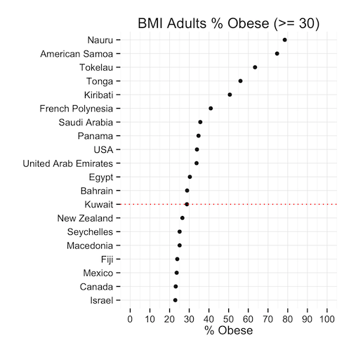
This means that, given the population of Kuwait, the ratio of obese people is less than the same ratio in 12 other countries. Is this good news? We’re still in the top 20! … but we’re not #1 (yet)
Round 2: Males
So the men had a great chuckle at these statistics I’m sure … well lets see hour our brothers at the sufra are doing. Proportionally, they are about the same as the general population: 29% … except they rank 10th now because as a ratio, our men weigh in heavier.

Round 3: Moment of truth, Ladies
Immediately we can see that the heavy set ladies in Kuwait are not #1 in the world (awww!) In fact, they are ranked in the 15th position – lower than the men and the general population. The proportion of females that are obese is only slightly higher than that of men.
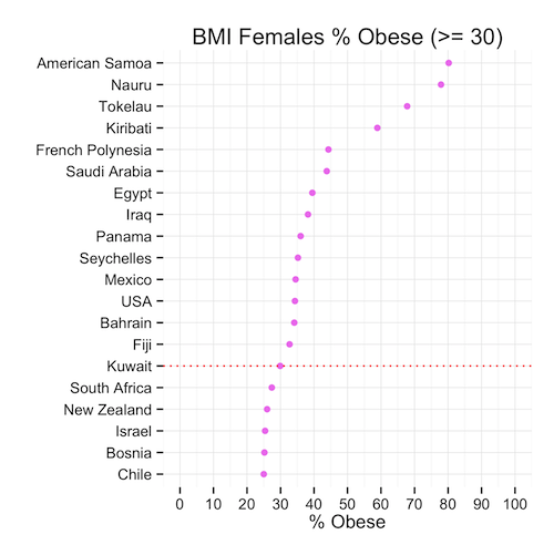
So we can conclude that, although the mean might show that Kuwait is #1 in the world, this is far from the truth when we look at the proportions that might in fact be a more representative indicator of spread and centrality of BMI.
Time for a cookie?
The Code
Lets look at how we produced the graphs. If you haven’t already, download the data sets (here or from the WHO’s website):
Now read this data intro R:
# Read Data obese.adults<-read.csv(file="BMIadults%obese(-=30.0).csv",stringsAsFactors=F) obese.male<-read.csv(file="BMImales%obese(-=30.0).csv",stringsAsFactors=F) obese.female<-read.csv(file="BMIfemales%obese(-=30.0).csv",stringsAsFactors=F) |
Great! We will need a few libraries so lets get those loaded:
# Load Libraries library(gridExtra) library(reshape) library(ggplot2) |
Now we want to play with our data before we can plot it.
We will pick the top 20 countries ordered by BMI value and create each plot accordingly.
# Select Top X Countries topx<-20 # Create Plot 1: % Adults Obese # Melt the data p1<-melt(obese.adults) # Select only the most recent data p1<-p1[p1$variable == "Most.recent",] # Sort the data p1<-p1[order(p1$value,decreasing=T),] # Remove any empty rows p1<-p1[!is.na(p1$value),] # Select Top X countries p1<-head(p1,topx) # Find Kuwait in the Top X Countries to highlight kuwait<-nrow(p1)-which(reorder(p1$"country...year",p1$value)=="Kuwait",T,T)+1 plot1<-ggplot(data=p1,aes(y=reorder(p1$"country...year",p1$value),x=p1$value))+ geom_point(color=I("black"))+ ylab("")+xlab("% Obese")+ggtitle("BMI Adults % Obese (>= 30)")+ scale_x_continuous(limits = c(0, 100), breaks = seq(0, 100, 10))+ theme_minimal()+ geom_hline(yintercept=kuwait,linetype="dotted",colour="red") |
That was the first plot, and now we repeat this 2 more times
# Create Plot 2: Females % Obese p2<-melt(obese.female) p2<-p2[p2$variable == "Most.recent",] p2<-p2[order(p2$value,decreasing=T),] p2<-p2[!is.na(p2$value),] p2<-head(p2,topx) kuwait<-nrow(p2)-which(reorder(p2$"country...year",p2$value)=="Kuwait",T,T)+1 plot2<-ggplot(data=p2,aes(y=reorder(p2$"country...year",p2$value),x=p2$value))+ geom_point(color=I("violet"))+ ylab("")+xlab("% Obese")+ggtitle("BMI Females % Obese (>= 30)")+ scale_x_continuous(limits = c(0, 100), breaks = seq(0, 100, 10))+ theme_minimal()+ geom_hline(yintercept=kuwait,linetype="dotted",colour="red") |
Finally Plot 3
# Create Plot 1: % Male Obese p3<-melt(obese.male) p3<-p3[p3$variable == "Most.recent",] p3<-p3[order(p3$value,decreasing=T),] p3<-p3[!is.na(p3$value),] p3<-head(p3,topx) kuwait<-nrow(p3)-which(reorder(p3$"country...year",p3$value)=="Kuwait",T,T)+1 plot3<-ggplot(data=p3,aes(y=reorder(substring(p3$"country...year",first=0,last=20),p3$value),x=p3$value))+ geom_point(color=I("blue"))+ ylab("")+xlab("% Obese")+ggtitle("BMI Males % Obese (>= 30)")+ scale_x_continuous(limits = c(0, 100), breaks = seq(0, 100, 10))+ theme_minimal()+ geom_hline(yintercept=kuwait,linetype="dotted",colour="red") |
Lastly, we want to create our 3 plots in one image so we use the gridExtra library here:
grid.arrange(plot1,plot2,plot3) |
That’s it! You can download the entire code here:
Obesity.R
Next Steps
I will probably do a follow on this post by looking at reasons why obesity might be such an issue in Kuwait. Namely, I will look at consumption patterns among gender groups. Keep in mind, I do this to practice R and less so to do some sort of ground breaking study … most of this stuff can be done with a pen and paper.
References
![]() Posted by Salem
Posted by Salem
![]() May 13
May 13

Kuwait Sugar Consumption with R
I was doing Facebook’s Udacity Explorartory Data Analysis course and one of the tasks is to use GapMinder.org’s data to visualise data.
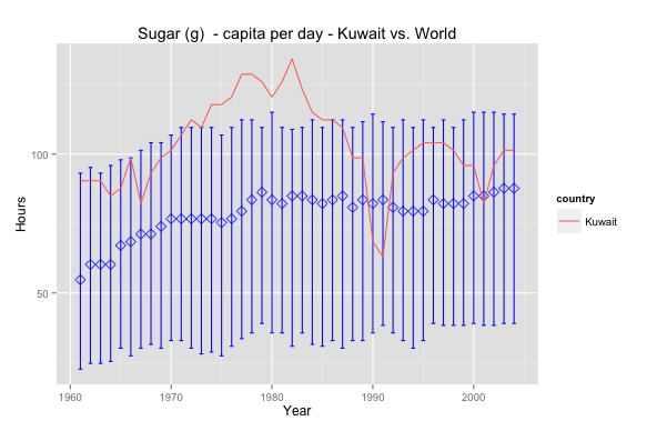
So I picked sugar consumption per capita per day; diabetes is a subject that has always been close and interesting to me. The graph above shows Kuwait’s sugar consumption relative to world averages.
Interesting that Kuwait has always been above the median and peaked in the 80’s – maybe that’s why obesity is such a prevalent issue nowadays. In 1990 the drop is, perhaps, due to a lack of data or perhaps due to an exodus of people. Nevertheless it seems that Kuwait has a long way to go in health awareness insofar as sugar consumption is concerned. Sugar consumption is lower today but still above the world median.
Want to reproduce this? Here’s the code – make sure to download the data set first! – :
# Data Cleansing data<-read.csv(file="gapminder.csv",na.strings="NA",row.names=1, header=T, blank.lines.skip=T) data<-(data.frame(t(data))) data<-data.frame(year=c(1961:2004), data) View(data) # Data Pivot library(reshape) data.melt<-melt(data,id='year',variable_name="country") data.melt<-subset(data.melt, value!='NA') data.melt.kuwait<-subset(data.melt, country=='Kuwait') data.melt.other<-subset(data.melt, country!='Kuwait') # Grouping data library('dplyr') year_group <- group_by(data.melt.other, year) wmsub.year_group <- summarise(year_group, mean=mean(value), median=median(value), lowerbound=quantile(value, probs=.25), upperbound=quantile(value, probs=.75)) # Plotting ggplot(data = wmsub.year_group, aes(x = year, y=median))+ geom_errorbar(aes(ymin = lowerbound, ymax = upperbound),colour = 'blue', width = 0.4) + stat_summary(fun.y=median, geom='point', shape=5, size=3, color='blue')+ geom_line(data=data.melt.kuwait, aes(year, value, color=country))+ ggtitle('Sugar (g) - capita per day - Kuwait vs. World')+ xlab('Year') + ylab('Hours') |
![]() May 11
May 11
 "Pin It")
Install R Package automatically … (if it is not installed)
This is perhaps my favourite helper function in R.
usePackage <- function(p) { if (!is.element(p, installed.packages()[,1])) install.packages(p, dep = TRUE) require(p, character.only = TRUE) } |
Why? Well …
Have you ever tried to run a line of R code that needed a special function from a special library.
The code stops and you think, “Damn … ok I’ll just load the library” – and you do.
But you get an error message because you don’t have the library installed … ya! #FacePalm
After the momentary nuisance you then have to:
- Type in the command to install the package
- Wait for the package to be installed
- Load the library
- Re-run the code
- Eat a cookie
Well that’s why this is my favourite helper function. I just use “usePackage” instead of “library” or “install.packages”. It checks if the library exists on the machine you are working on, if not then the library will be installed, and loaded into the environment of your workspace. Enjoy!
You can even use this as part of your R profile 🙂
![]() Posted by Salem
Posted by Salem

